While it's certainly important for a beer to taste good, there's no denying that packaging has a big influence on people's buying decisions.
Ten years ago, a lot of breweries found they could get away with soliciting a friend to design their beer packaging. Not anymore.
With so many beers competing for attention on the shelves, standout beer labels have become a critical part of any brewery's marketing strategy.
So which breweries have come up with those really standout designs? Here's a list:
- 21st Amendment Brewery
- Evil Twin Brewing
- Kiuchi Brewery
- Oregon Brewing Company
- New England Brewing Company
- Uinta Brewing Company
- Huyghe Brewery
- Anheuser-Busch
- Stone Brewing Company
- Magic Hat
- Cisco Brewers
- Newburgh Brewing Co.
- Flying Dog
- Lagunitas
Let's take a look at the 14 labels that set themselves apart.
14 of the Best Beer Labels Designs We Love
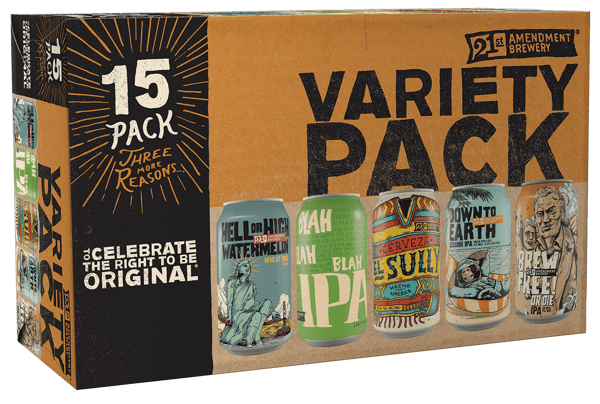
1) 21st Amendment Brewery
Source: Origlio
Didn't think some of the best beer label designs would be on a can, did you? For 21st Amendment Brewery, the decision to use cans -- and only cans -- was entirely intentional.
"Back in 2005, I was out at the Great American Beer Festival ... and I really saw the future of craft beer," Co-Founder Shaun Sullivan told Cool Material. "Back then no one was putting craft beer in cans. But, it’s portable, easy to recycle, and perfect for the outdoors. It was also interesting for marketing and telling the story as the can is 360 degrees of space, unlike doing a beer label on a bottle. Coupled with the box the cans come in, we really have a great canvas to get our story across."
Based in San Francisco, Sullivan and his business partner work closely with TBD Advertising in Oregon to come up with a design for each new beer that comes on the shelf. Designing and creating new beers is his favorite thing about making beer, he says.
2) Evil Twin Brewing
 Source: Evil Twin Brewing
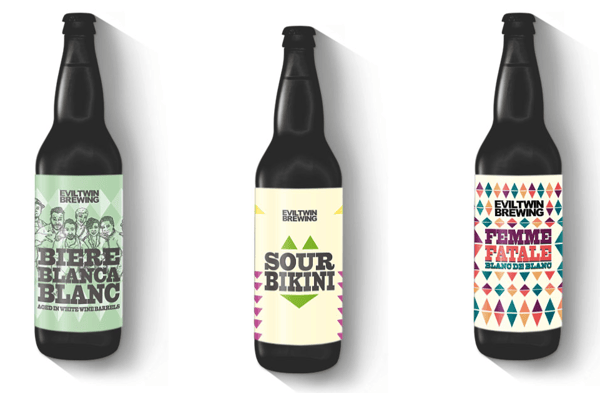
You might think a brewery with such creative names and crazy cool, fractal-like designs has a whole design team behind them. But that's not the case. The beer-naming and label-designing at Evil Twin Brewing are divided between its two co-founders, Jeppe Jarnit-Bjergsø and Martin Justesen.
Jarnit-Bjergsø is responsible for coming up with the beer names (although he admits his wife, who's a copywriter by trade, comes up with most of them), while Justessen designs all the labels.
"I’ll often start doing sketches when I hear the name of the beer," says Justesen. "The look of an Evil Twin label is quite geometrical and graphical. Every label is built up by triangular shapes. I like for the labels to work on two levels, the first to grab your attention by standing out, and the second by containing details you later discover when you sit down and look at it close up."
As for naming the beer? Some of our favorites include "Even More Jesus," "Bikini Beer," and "Before, During, and After Christmas."
"Our philosophy behind beer names is that we aren’t weird just to be weird," says Jarnit-Bjergsø. "That said, I do like the idea of having names that don’t make sense -- it means that if you see the name, you have to think about it, you have to consider what it is. If a beer is called 'Brown Ale,' you forget it a second later, because everyone knows what a brown ale is, and has seen that name 100 times before. But if you see a name that’s more interesting, you’re automatically like, 'I wonder what that is?' And that way you just remember it better."
3) Kiuchi Brewery
Kiuchi's been making sake since 1823 -- way before they began brewing beer in 1996. And with distribution routes in over 30 countries and a gold medal at the Brewing Industry International Awards under its belt, it's clear they're darn good at it.
 Source: South China Morning Post
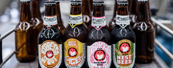
The packaging of their series of Hitachino Nest beers features a distinctive red owl and the brewery's name in gold lettering. The same cartoon-like red owl appears on every rendition of the Hitachino Nest series, making it easy to pick out from the crowd. You'll notice the names of the beers -- and their ingredients -- are also distinctly Japanese: The "Red Rice Ale" uses red rice, a type of ancient Japanese rice; "Nipponia" uses a barley malt and hop from Japan; "Ginger Ale" uses wild-bred mandarin grown near the brewery. The brewery's president Toshiyuki Kuichi says these names and ingredients help attract foreigners' curiosity.
4) Oregon Brewing Company
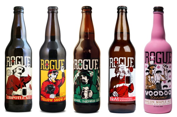
Oregon Brewing Company's line of Rogue ales is another example of great beer names paired with beautiful label designs. From "Chipotle Ale" to "Yellow Snow Ale" to "Voodoo Doughnut" (a bacon maple ale that comes in a bright pink bottle), the names -- and flavors -- certainly coincide with the brewery's bold personality. The illustrations on many of the labels feature a person either holding up his or her left fist, or holding a beer and offering a "cheers" to the drinker.
Source: Brewers Journal
Other Rogue beers playfully mock popular culture, like the "Sriracha Hot Stout Beer" pictured below. The beer is made from Huy Fong original hot chili sauce and, according to Rogue Brewing President Bretty Joyce, it became a record-selling product for the brewery within only a few days of its debut -- even though many people find its distinctively spicy taste questionable.
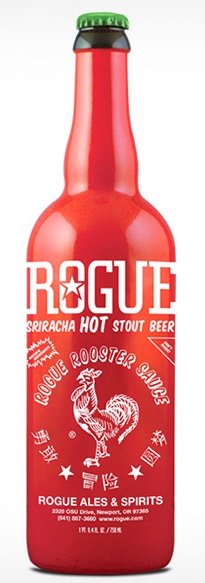 Source: uncrate
5) New England Brewing Company
The label on the "Imperial Stout Trooper" from New England Brewing Company is nothing short of amazing -- and the story behind it is pretty funny, too.
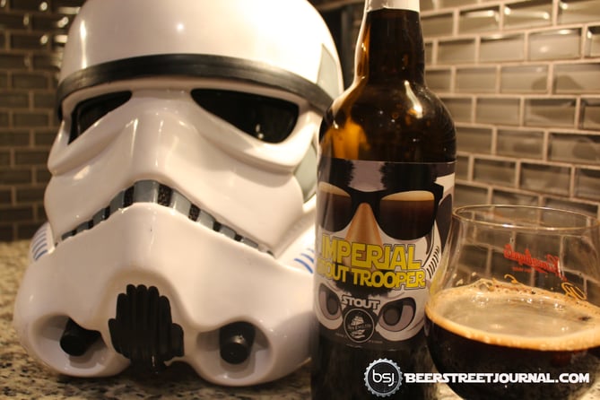
Source: Beer Street Journal
Each year, the brewery creates a special release beer, which is why they first brewed the Imperial Stout Trooper in 2007. It was an instant hit and the first batch initially sold out, and the beer itself quickly became something of a Star Wars fan cult item.
When it was first released, its label featured an undisguised Stormtrooper's face. But in 2010, they were forced to change the label due to copyright infringements ... which is why the Stormtrooper on the label now wears a Groucho Marx disguise. The label change made the already rare Star Wars-themed beer even more sought after than it already was.
6) Uinta Brewing Company
Salt Lake City-based Uinta Brewing first hired The Tenfold Collective, a small design firm based in Colorado, in 2010. Since then, the firm has created plenty of beer labels for the brewery and launched its beautiful new website. The bright color schemes and attention to detail make these labels fun to take a closer look at. Plus, they look a heckuva lot like vintage ski posters, reminiscent of their Utah/Colorado origin.
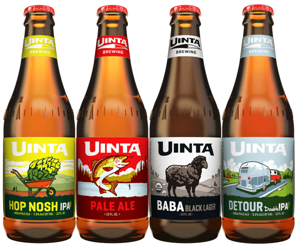
Source: DrinkedIn
On their blog, the folks at Uinta describe the "classic Uinta feel" as one that "reflects an appreciation for the outdoors and the timeless beauty of the mountain west." After all, the company's namesake is Utah's tallest mountain range, the Uinta Mountains.
7) Huyghe Brewery
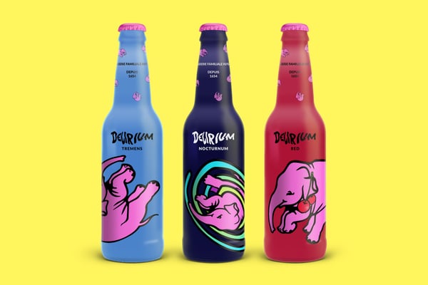
Source: Jan Baca
You probably recognize this one thanks to the iconic pink elephant ... it's Belgium-based Huyghe Brewery's famous Delirium beers. Although the Delirium beers' names are famous now, the folks at Huyghe actually had some trouble getting them on the shelves for a while because of the name. For example, Delerium tremens refers to the shakes that alcoholics get when suffering from withdrawal, which are often accompanied by visions (like pink elephants).
Despite the controversy in the name, this beer managed to become one of the most well-known brands in the world. The name is written in what looks like the Kilkenny font, the pink elephant has become an icon, and the white bottle -- which contrasts interestingly with the dark beer within -- is easily recognizable on a shelf.
8) Anheuser-Busch
While most beer labels limit the design to what's printed on the label itself, the folks at Anheuser-Busch let the shape of the label do some of the talking. The brewery's marketing team positions their tequila-inspired Oculto beer around mystery and spontaneous nights out with friends, which is reflected in its packaging.
The Oculto label features a white skull with the eyes cut out. When the bottle is cold, the logo turns fluorescent and the skull's empty eyes glow green thanks to temperature-responsive, thermochromic ink, according to Packaging Digest.
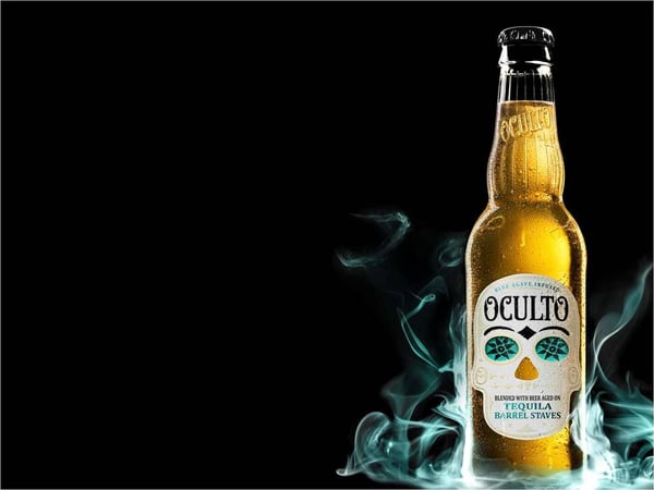
Source: 303 Magazine
Check out the Instagram post below, which shows the cool effect of being able to see the beer and flickering candlelight through the label.
9) Stone Brewing Company
The graphics and colors on Stone Brewing Company's beers are bold -- and so is their copywriting. The gargoyle is there to protect beer lovers from the "fizzy yellow" beer.
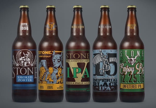
Source: Behance
The description of their Arrogant Bastard Ale reads, "Brought forth upon an unsuspecting public in 1997, Arrogant Bastard Ale openly challenged the tyrannical overlords who were brazenly attempting to keep Americans chained in the shackles of poor taste."
10) Magic Hat
Magic Hat is proud of its deep connections with the arts community in its home city of Burlington, Vermont -- even their brewery's bar and shop is called The Artifactory -- so it's no surprise that its packaging is an artistic masterpiece itself. Each beer's label features colorful, trippy, and super detailed illustrations.

Source: Behance
Where does the brewery draw its design inspiration? Concert posters, according to their blog. Several years ago, the folks at Magic Hat teamed up with printmaker Jim Pollock -- the same Jim Pollock who became famous for creating many of Phish's most memorable concert posters. For the most part, though, the brewery sources design work in-house.
But the company doesn't just pair up with famous designers to design their beer labels. Every few years, they hold a "Labels for Libations" design contest to raise money for the local art scene, in which they solicit local artists to compete to design a label for a beer that'll be released the following year. Here was the 2014 contest's winning label:
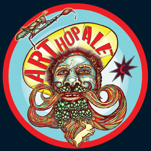
Source: Magic Hat Brewing Co.
Finally, let's not forget the copy on the inside of the beer caps of Magic Hat's best-selling beer, #9. Someone's even dedicated an entire Tumblr blog to Magic Hat beer cap "wisdom." (I put wisdom in quotes because, well ... you'll see.)
A few of our favorites? "Remember the Dinosaurs"; "Why Don't They Call 'Em Bottle Hats?"; "Don't Cook Bacon Naked."
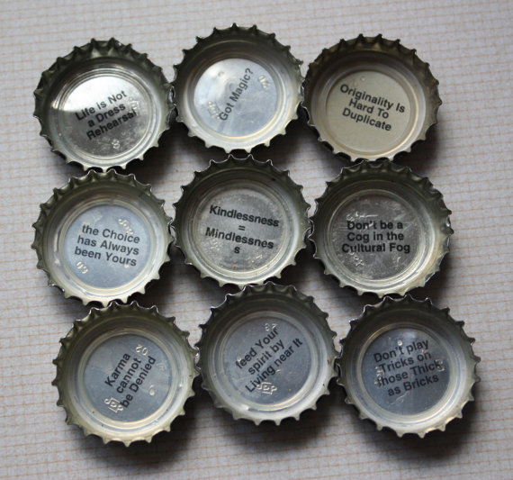
Source: bigblueapothecary Etsy shop
11) Cisco Brewers
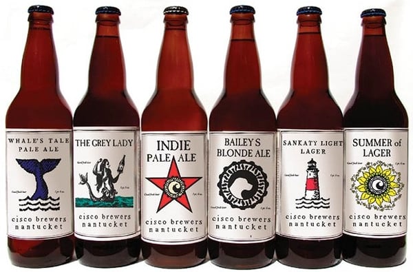
There's something so refreshing about simplicity in design. That's what Cisco Brewers accomplishes with its beer labels, all of which are clean and minimalistic. Each has a single-color design that looks old-timey -- almost like a woodcut from the 19th century. The simple approach they take with their brand is reminiscent of Nantucket Island -- where the brewery is located -- and its untouched, clean look and feel.
Source: Brookston Beer Bulletin
"Most of the original labels were just our logo -- the name of the beer on different colored paper to designate the different styles," Jay Harman, one of Cisco Brewers' three founders, told me. "As time went on we started to work on more wood cut branded pieces that would allow customers to relive their island experience wherever they were consuming our beer."
The labels themselves were designed by a combination of the brewers' founders and some local artists from Nantucket. Local artist George Murphy created the "Whale's Tale Pale Ale" logo, Cisco co-founder Randy Hudson did the "Sankaty Light" label and the "Indie Pale Ale" label; Wendy Hudson, Cisco's other co-founder, did the "The Grey Lady" label; and local graphic artist Malcolm Brooks did the "Summer of Lager" logo.
Not only are Cisco's traditional labels cool, but so is their recent collaboration with Marine Research Group OCEARCH. Last fall, Cisco released a brand new beer called the "Shark Tracker Light Lager" to benefit research and education about the ocean's predators -- and to inspire fascination, rather than fear. Scan a can with the lab's mobile app and you can access all kinds of information about their research on sharks, watch videos, and so on. It's a very cool, interactive touch.
Source: Brewbound
Finally, we couldn't very well leave out Cisco's tap handle designs. When you're in a crowded bar wondering which beer to order, where do you look to figure out what the place has on draught? The beer taps, of course. That's why it's so important for them to stand out. For many breweries, the tap handle becomes a calling card.
"Off-island, tap markers designate the real estate behind the bar, so it's important for customers to know what's being poured," says Harman.
Cisco's designed big, carved-wood tap handles for its four most popular beers that really stand out. Here's the tap handle for its Grey Lady beer:

Source: beertaps.blogspot.com
12) Newburgh Brewing Co.
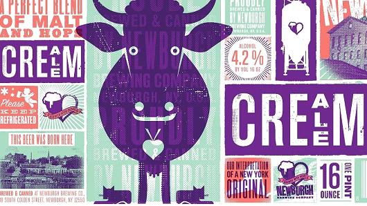
With so many beers on the market these days, it can be really hard to stand out on the shelf. This is what drove Newburgh Brewing Company to solicit a busy and colorful label design for their Cream Ale, according to their COO and president Paul Halayko.
The label features the company mascot Betsy the Cow along with icons from around Newburgh, New York. You can see imagery of the brewery's building, the Hudson Valley, and phrases showing they're proud to be local like "This beer was born here" and "Our interpretation of a New York original". Designed by Philadelphia-based design firm Modern Good, it beat 64 brands to win CNBC's best-loved beer label for 2015.
Source: CNBC
13) Flying Dog
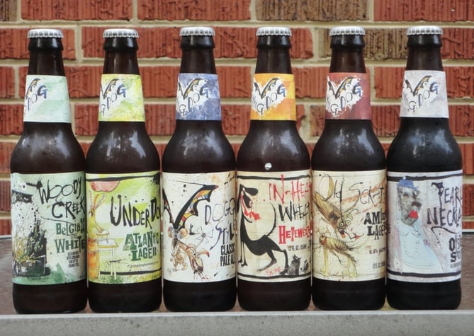
Back in 2012, Flying Dog Brewery rolled out new packaging with the goal of better reflecting the "insanely chaotic, yet intricately detailed" Ralph Steadman art on their labels. Steadman, a prolific artist who's produced thousands of iconic illustrations, has been creating all the original art for Flying Dog's beer labels in 1995. His designs are splatter art illustrations, often featuring mythical creatures.
Source: BOA Beer Blog
On Steadman's official art collection website, his art for Flying Dog is described like this: "Steadman's illustrations have caused outrage in some, been banned by some states, but have beer drinkers of the world over rejoicing. The perfect marriage of taste and rage, poetry for the senses and an orgy for the imagination."
14) Lagunitas
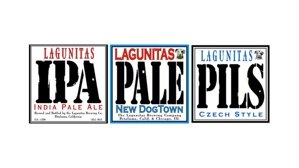
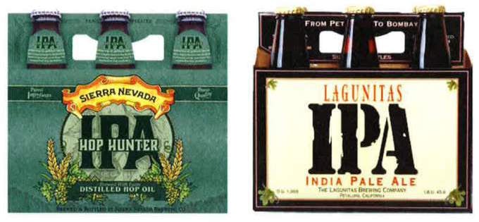
Lagunitas' highly recognizable beer labels are characterized by an old-school white background and large, all-caps letters. But because their labels are so simple by design, they've experienced some trademarking trouble in the past. Right now, the brewery has four federally registered trademarks and two pending trademarks all relating to their most popular beer, Lagunitas IPA, against Sierra Nevada Hop Hunter IPA.
SourceL Behance
Below, you'll see the similarities between Lagunitas' IPA label (right) and Sierra Nevada's (left):
Source: The Press Democrat
Does the label even matter?
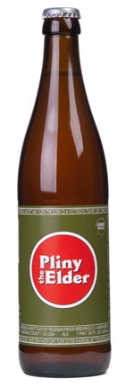
Here's the thing, though. There are plenty of beers out there doing just fine with totally generic labeling. Take Russian River's "Pliny the Elder," for example. It's widely regarded as one of the best beers in the world, and it's been named America's best beer for seven years straight. And yet, its label is as basic as it gets.
 Source: Russian River Brewing
If a beer crosses a certain taste threshold, does the label just not matter anymore? Or is beautiful packaging a new brewery's best bet at getting their beer noticed on crowded shelves?
Whatever it is -- we'll drink to that.
from Marketing https://blog.hubspot.com/marketing/beer-label-designs

No comments:
Post a Comment