Monday, 4 June 2018

3 Reasons Why Facebook Is Removing the Trending Section: Our Experts Weigh In

Facebook announced on Friday that it would remove Trending: the section of its site, typically appearing to the right of the News Feed, that displays a list of the most popular news topics at a given moment.

"We’re removing Trending soon to make way for future news experiences on Facebook," wrote Facebook Head of News Products Alex Hardiman in an official statement. "From research we found that over time people found the product to be less and less useful."

Trending was first launched in 2014 "as a way to help people discover news topics that were popular across the Facebook community," Hardiman wrote, but will now be phased out as Facebook introduces additional news-related products.

However, many suspect that there are other reasons for the removal of Trending from Facebook. To take a deep dive into them, I posed the question to my team: "What is this really about?"

Here's how our experts weighed in on the matter.

Why Is Facebook Really Removing Trending?

1. Negative Stories About Facebook Often Appear in Trending

Trending, according to Facebook's official description, aggregates the most popular news items among Facebook users "based on the number of publishers that are posting articles on Facebook about that subject and the engagement level of those articles."

But Facebook has received a high degree of scrutiny and related news coverage over the past year, from a series of PR nightmares ranging from its role in election interference to the misuse of personal data by voter profiling firm Cambridge Analytica. Those stories have often taken a top position on the site's Trending list.

When news broke that Trending would be phased out, for example -- it, too, was discovered by many to take a top rank withing Trending.

"It seems to me like it could also be a strategic move on the brand side, given how much of the 'trending' news over the past few months has been around the Cambridge Analytica controversy," says Annabelle Nyst, a HubSpot content strategist. "If they’re committed to transparency, they can’t remove that content from the Trending section  ... but they can remove the section" itself.

2. Facebook Has Come Under Fire for Fake News Ranking on Trending

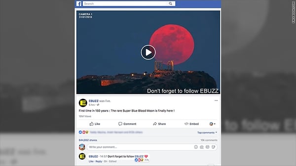
As Facebook has said itself, Trending aggregates news topics based on what's being shared on Facebook by users the most. However, much of what is often most popularly shared consists of false content; e.g., a "live feed" of the supermoon cast in February of this year that actually turned out to be a continual broadcast of a still [stolen] image with sound effects playing over it, which received at least 16 million views.
180131111631-facebook-supermoon-video-780x439

Source: CNN

Facebook has announced a number of features and efforts to curb the spread of such false content since it was first revealed that the site was weaponized by foreign actors to spread misinformation and influence the 2016 U.S. presidential election, largely through ad content. 

However, despite Facebook's claims that "our team is responsible for reviewing Trending topics to ensure that they reflect real world events," news content that was often less-than-real sometimes slipped through the cracks and still made its way onto the Trending section. The company made several efforts to fix that prior to announcing the removal of the section, including ranking only topics that were covered by several news publishers.

"The idea was that coverage by just one outlet," wrote The Guardian's Press Association, "could be a sign that the news is fake."

The removal of Trending is just the latest in a series of moves by Facebook to slow to spread of false content, the efforts for which could be expected to ramp up in the months leading to the 2018 U.S. midterm elections.

In January, the company announced that it would sharply shift its News Feed algorithm to prioritize content from a user's friends and family, and in April said it would apply more context about publishers and articles appearing there.

"I actually think it's consistent with Facebook's prior announcements that it's going to focus more on local news versus global news outlets, or news outlets that get benefits for being big in Facebook's current newsfeed algorithm," says HubSpot Head of SEO Victor Pan, referring to Facebook's announcement that news items within a certain geographic radius would be prioritized in a user's News Feed. "Local publishers will benefit ... global outlets, like Reuters, AP, AFP will get hit hardest."

3. Authentic News Publishers Didn't Benefit From Trending

Trending, wrote Hardiman in his statement, "was only available in five countries and accounted for less than 1.5% of clicks to news publishers on average." For that reason, it seems, the lack of benefit to authentic news outlets is part of Facebook's reasons for removing the section.

Given Facebook's other recent efforts to prioritize more authentic content -- sometimes by way of personalization and localization -- from various news sources, HubSpot Social Media Editor Henry Franco says that this reasoning seems legitimate. 

"It’s a low traffic avenue, and with the platform catering towards video and mobile, there isn’t much of a reason to keep it," he says, pointing to Trending's mainly desktop-experience nature. "It seems like Facebook is still prioritizing breaking and local news, so I’m not sure they’re really up to anything."

Whether or not authentic news publishers will actually benefit from this change is another story -- one that Franco doesn't think is entirely likely.

"But since Facebook has all of the leverage here," he says, "I don’t think that matters to them."

Looking ahead, Facebook is addressing the mobile-first preference among users to consume news content that Hardiman says it's observed.

"We’ve seen that the way people consume news on Facebook is changing to be primarily on mobile and increasingly through news video," he wrote. "We’re exploring new ways to help people stay informed about timely, breaking news that matters to them, while making sure the news they see on Facebook is from trustworthy and quality sources."

One of those methods, Hardiman says, is by applying a "Breaking News" label to news matching that descriptor. Facebook is currently testing that feature with 80 publishers across several countries -- "North America, South America, Europe, India and Australia" -- which allows the publishers to apply this label themselves.

The new features will also include a "Today In" section of the site, where Facebook users can view breaking news from local publishers as a community. If that sounds familiar, it might be due to Google's recent announcement of a similar feature in its new Google News app.

Given the sum impact of all these factors, Nyst says, the time spent on Facebook could be an underlying motivator for this latest move. 

"Who knows if that’s damaging user retention at all?" she asks. "But I can’t imagine it’s helping."

Featured image source: Facebook


from Marketing https://blog.hubspot.com/marketing/facebook-removing-trending-section

10 Web Form Examples You'll Want to Copy Immediately

In recent years, I feel a bit spoiled when it comes to filling out online forms -- typically, they’re able to auto-fill my information, and take less than a minute to get me what I need.

Forms used to require so much information, you’d have to really, really want something to dedicate the time to filling one out.

Now, we notice immediately if a form is cumbersome or time-consuming -- because so many forms aren’t. If a form doesn’t almost instantaneously get us what we want, we ditch the page.

Here, we’ve collected some of the most impressive online forms so you can learn by example, and hopefully apply some of these methods to your own web forms moving forward.

1. Kickstarter

Kickstarter’s sign-up form is clean, with a basic white background, so you can focus on the form fields that matter. It also doesn’t ask for too much information, which is key for holding the attention of a busy audience.

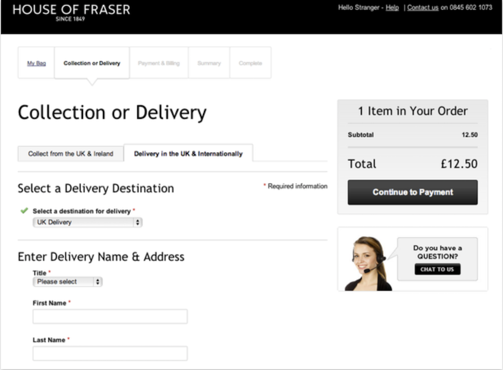
2. House of Fraser

House of Fraser’s form is enticingly easy, with a pull-down menu to select delivery methods and columns like “collection or delivery” and “payment and billing”, so you can see where you are in the process. Best of all, the form incorporates the option for live chat. If a buyer is having concerns or doubts, it’s useful to have the ability to get clarification within the form itself without leaving the page.

House of Fraser

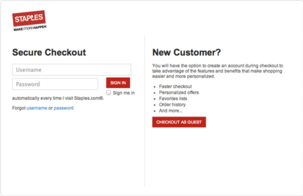
3. Staples

A guest checkout option is often imperative to ensure anyone can buy your product, with or without an account. If someone is in a rush, they might become frustrated by a lengthy “Create Account” form, and abandon their efforts. Staples understands the necessity of guest checkout, and finds a way to include it without losing too many new account owners to that option -- underneath their "New Customer" field, they outline benefits to creating an account versus guest checkout. Creating an easier new customer sign-up is an effective way to convert more users into account owners.

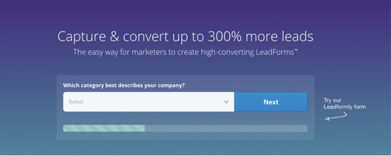
4. Leadformly

I’m willing to bet when you see only one question, you’re more willing to fill it out than if you were shown a long list. By keeping it to one field box at a time and creating a progress icon at the bottom, Leadformly likely mitigates the amount of users who leave the page before completion.

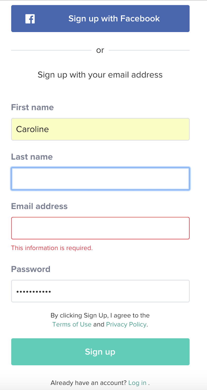
5. Class Pass

Allegedly, blue produces a calming effect, which is exactly how I felt checking out Class Pass’s landing page and immediately seeing a blue free trial button. Clearly, they know what I want. Their form is one of the easier ones in the list: it only requires your name, email, and password, or you can sign in via Facebook. Plus, when you fill out the form, you’re immediately gifted with a certain amount of credit, and a message that tells you the average amount of classes you can take in your city with those credits.

6. Toptal

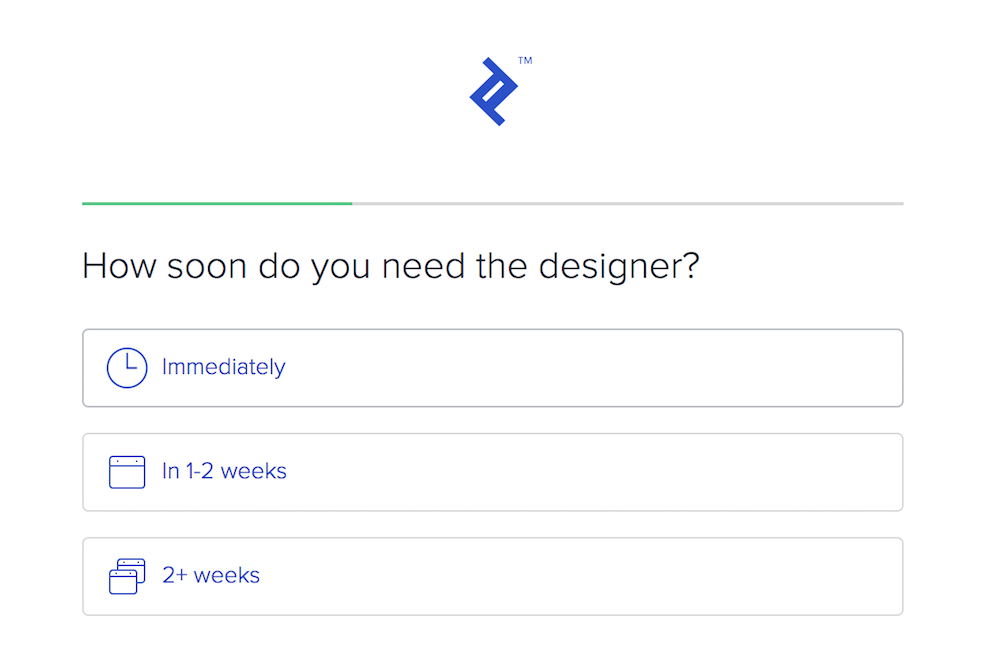
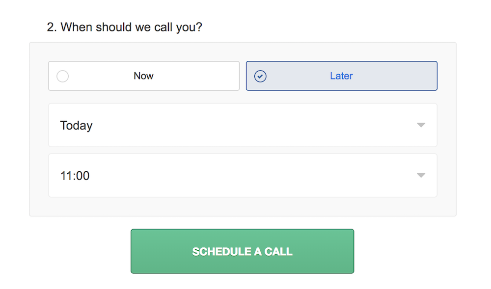
A form should still abide by quality customer service rules. How can your form be helpful to a potential consumer, without frustrating them with unnecessary questions? Toptal, which helps you find and hire elite independent freelancers, does an incredible job, first by displaying how far along a user is in their form submission (which encourages them to keep going), and second, by incorporating a phone conversation seamlessly into the process.

After answering a few questions, their form concludes with a question: When should we call you? You’re given the option of now or later, and once you’ve answered, the form offers to automatically integrate your scheduled phone call into your Google calendar or iCalendar. Toptal knows its value is better explained via phone, and their form proves they respect your time and don’t want to waste it.

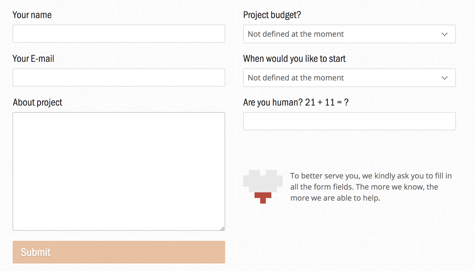
7. UX Passion

Sometimes you need to ask for more information than just name and email, which can frustrate a user. If you incorporate a message like UX Passion’s -- “The more we know, the more we are able to help” -- it could go a long way towards alleviating that frustration. Their message adds a human element, reminding you that the form fields were chosen as necessary elements to help you, not just to waste your time.

8. Basecamp Classic

As soon as you arrive at Basecamp Classic’s page, you’re greeted with a form. At the top, the form mentions how long it will take to fill out (60 seconds), and at the bottom, it highlights the benefits of the free plan and promises the trial won’t end. With those statements sandwiching the top and bottom of the form, it’s likely most visitors will fill it out because -- well, why not?

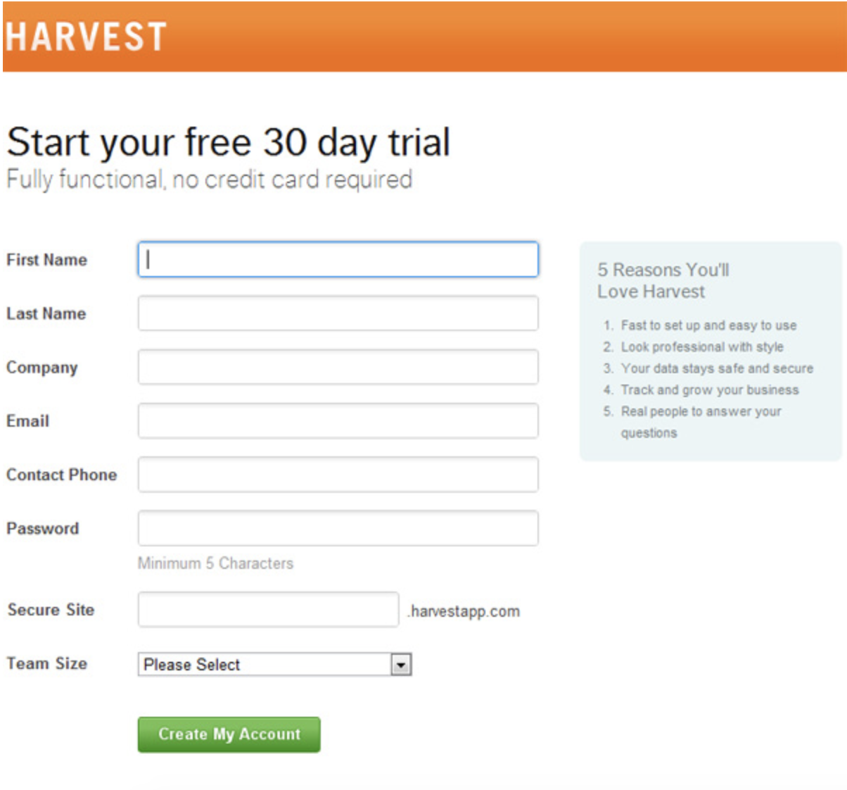
9. Harvest

There are two reasons I love this form by Harvest: first, it answers my primary concerns upfront -- Will I have to supply a credit card and risk getting charged if I don’t cancel my account? And what am I missing out on with the free version?

The second reason I love the form is the “5 Reasons You’ll Love Harvest” box on the right. The rest of the form is neat and clean, so there’s no confusion about where or what to fill out, but if you begin to waiver, the box on the right is an extra step to ensure you remember why you’re signing up.

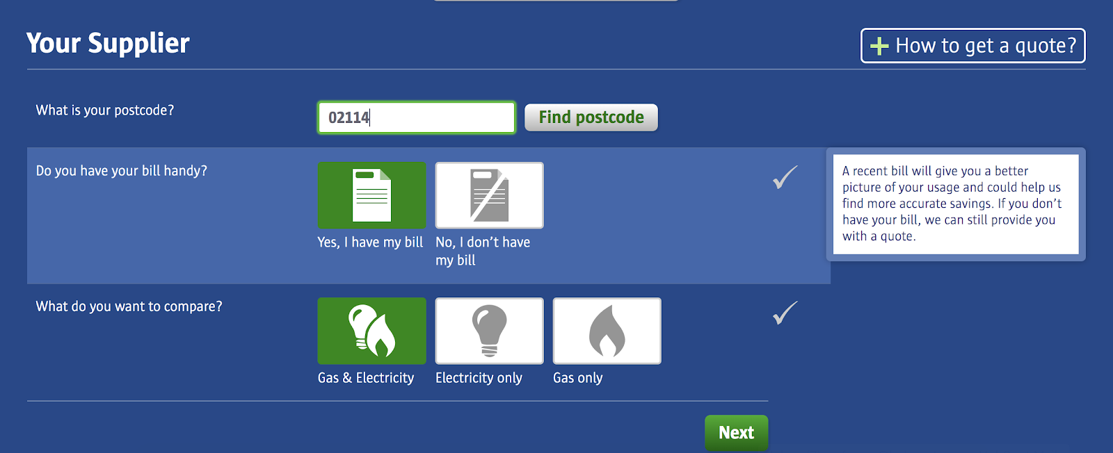
10. Compare the Market

This is one of the most user-friendly ones in the list, with icons you can hover over to choose A or B, rather than a text field. Best of all, when you hover over an icon like “Yes, I have my bill,” you’re offered an explanation regarding why it’s necessary, and whether you can proceed without it. Plus, the buttons are big and colorful, creating an engaging and visually appealing user experience.

If you’re still unsure which direction you need to take your online forms to make your buyer happiest, try A/B testing one of these elements at a time. Ultimately, your form is a method to interact with your customers, so it should be thoughtful, relatively easy, and a strong reflection of your brand.


from Marketing https://blog.hubspot.com/marketing/form-examples

11 Surprising, Funny & Cool Google Easter Eggs

Sometimes, it seems like the internet is full of tedium -- waiting for a page to load, juggling different passwords, and trying to find the perfect GIF image to describe your mood. But luckily, it's also full of really cool nuggets -- specifically in Google products.

Thanks to the clever developers at Google -- who make it their mission to put the fun back into our daily routines -- there are numerous "Easter eggs" hidden across Google's suite of apps and tools that remind you how important the "human" side is to our favorite products.

Easter eggs are hidden gems, features, or moments of surprise buried within software and throughout the internet. They're designed to catch you off guard and make you smile -- if you can find them.

But why would you hide these fun, delightful gems? And since Easter eggs typically don't add much functionally to the software or website, why bother taking the time to code them in?

A few years ago, HubSpot's VP of Marketing, Meghan Anderson, asked a few of our colleagues for their opinions on the matter. And while she found that you'll get a different answer from every person you ask, most answers boil down to the same motive: "for the fun of it."

Mike Champion, Tech Lead at HubSpot

mike champion

"Adding an Easter egg can be a fun diversion when writing challenging code ... and it'll hopefully amuse some people, too."

Eric Peters, Senior Growth Marketing Manager at HubSpot Academy

eric peters

"Easter eggs are fun to build and fun to find, because they reward users that care enough to find and get excited about them. They create this feeling of being an insider with the application or company, which can be incredibly valuable in terms of brand loyalty and engagement."

Laura Fitton, Inbound Marketing Evangelist at HubSpot

laura fitton

"I feel like Easter eggs are part of the 'developer' personality. These are very smart people who love solving puzzles, and the intricacies of their work isn't ever fully appreciated by most of the customers using their product. So by hiding an Easter egg, they can reward the customers who do take that extra initiative to really dig in and appreciate the software -- and what goes into making it."

Sharing these gems feels a bit like revealing the secret to a magic trick. After all, half the fun surrounding Easter eggs comes from the hunt for them. So, if you prefer to be surprised, stop now and instead grab the guide below to see how interactive content can help your next marketing campaign:

Click here to download our curated collection of interactive content examples.

11 Surprising Google Easter Eggs

Easter egg hunting is a little easier if you've got a map. With some help from co-workers, Reddit, Little Big Details, Quora, and other sites, I've compiled a starter map for you, complete with some of the best hidden features on Google right now.

1. <Blink>

It's been a long time since Google was "just" a search engine. But for those who want to have a bit of fun with its search feature, you're in luck -- Google's developers have a sense of humor.

To start, look at what happens when you enter the query, "<blink>":

The word "blink" actually blinks in all of the search results. It's a sneaky, cheap thrill for those of us who are easily amused.

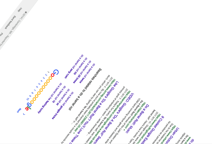
2. Do a Barrel Roll

This is probably my favorite Easter egg on Google. Type in "do a barrel roll" into the Google search bar, and see what happens. I'll wait.

All done? Here's a snapshot of your journey to remember it by:

Google Easter egg allowing you to do a barrel roll

Now that you're right-side up again, let's reflect on your experience. This funny feature is one of the oldest Easter eggs hidden in Google's programming, but it never seems to get old.

"Do a barrel roll" is just the tip of the iceberg, though. If you can believe it, there's also a function that allows you to "do a barrel roll twice." Type this command into Googe's search bar and click the first result that appears. This webpage rolls you around twice for maximum dizziness and, as your reward, offers a series of other Easter eggs on Elgoog -- Google's mirror-image website ("Elgoog" being "Google" spelled backwards).

3. Google Maps

While it didn't take long for this easter egg to become discovered (and widely talked about), it's still a pretty cool online treat. For April Fool's Day 2017, Google Maps allowed users to turn its maps platform into a game of Ms. PAC-MAN:

The feature may have been intended as an April Fool's joke, but as of the following Monday, it was still present on Google Maps -- and the top search results for "Google Maps Ms. PAC-MAN" mostly covered ways to remove it.

4. Google's Dinosaur Game

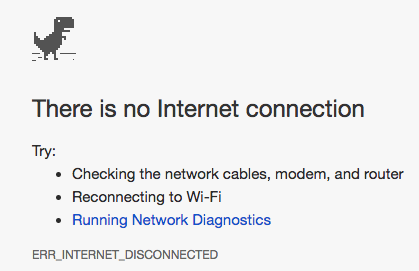
Does this dinosaur look familiar?

Google's dinosaur game easter egg

Chrome browser users might recognize him from a lack of internet connection. But now, there's actually reason to rejoice when Chrome can't connect. Even if you're offline, when you land on that screen, watch what happens when you press the spacebar:

Well, I know what I'm doing next time the in-flight Wi-Fi isn't working. And, good news for those who need more reason to procrastinate: Someone took the liberty to create the T-Rex Runner game page, so you can play any time. Plus, Android users can download the game here.

5. Bork, Bork, Bork!

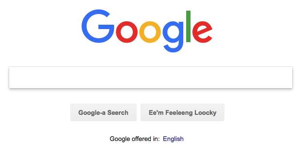
If you're familiar with the Muppets, chances are you've at least heard of the Swedish Chef character, who's known to end his intro song with the words, "Bork, bork, bork!" Google has taken that phenomenon and incorporated it into its own language settings. Yes -- "Bork, bork, bork!" is a language option.

To change your language settings, you must be logged into Google. Here are the steps to find this Easter egg:

  1. Once logged into Google, visit the Google Search homepage and click your profile picture on the top-right.
  2. Select "My Account," and click "Language & Input Tools" in the Account preferences box on the menu that appears.
  3. Select the "Language" bar, and click the pencil icon on the next page to find "Bork, bork, bork!" as an available language.
  4. Select this as your default language and return to the Google Search homepage. (Don't worry, you can return to English with a shortcut link below the search bar.)

Here's what Google's homepage looks like after selecting that as your preferred language:

Bork, bork, bork! language setting in Google

"Feeleeng loocky"? Excellent. Try your hand at Google's other language options, which -- like Facebook -- include Pirate and Klingon.

6. 'I'm Feeling...'

I'll admit it -- I've never really bothered by Google's "I'm Feeling Lucky" button below the search bar because, well, I always seem to forget it's there. But it looks like I've been missing out on a little trick.

If you hover your mouse over the button -- without typing anything into the search box first -- the text will spin like a slot machine into other options, like "I'm Feeling Hungry," or "I'm Feeling Stellar." Clicking on one will bring you to a topic-specific page:

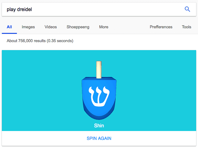
7. Play Dreidel

Hanukkah season or not, this Google Easter egg is available year round at your command. Specifically, that command is the Google search, "play dreidel."

Google Easter egg allowing you to play dreidel

Type these words into the Google search bar to play an endless digital game of dreidel with Google. Just click "SPIN AGAIN" below the blue dreidel, and Google will randomly land on one of the four classic Hebrew characters after a three-second spin.

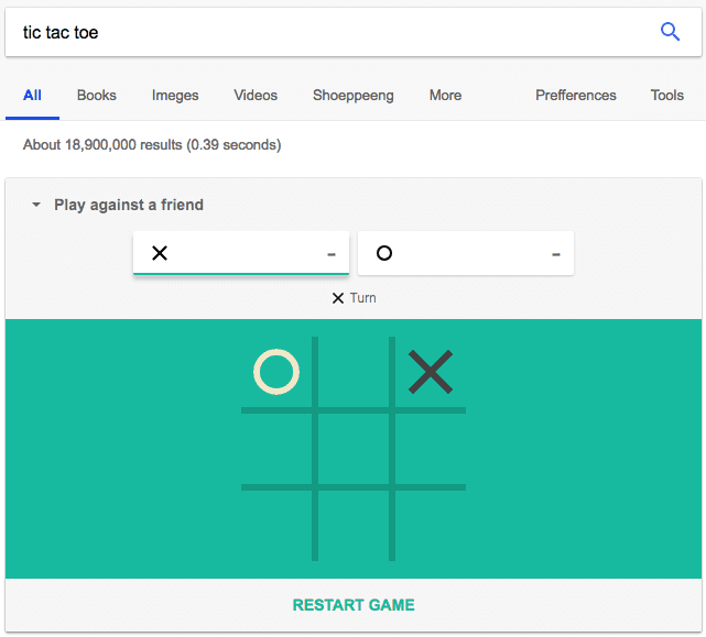
8. Tic Tac Toe

Here's another crowd-pleaser for the tabletop gamer. Google creatively allows searchers to play tic tac toe right on the results page. Just type in "tic tac toe" into Google's search bar. It's a nice surprise if you were initially looking for a tic tac toe website or template.

The best part? You can play against a friend on the same computer -- or against Google. That's right, challenge the search giant itself to a game of Xs and Os.

Google Easter egg allowing you to play tic tac toe

If you're playing against Google, this Easter egg allows you to adjust the difficulty to "Easy," "Medium," or "Impossible." Google has the gaul to skip right past Hard. One can only imagine the tactics it throws at you.

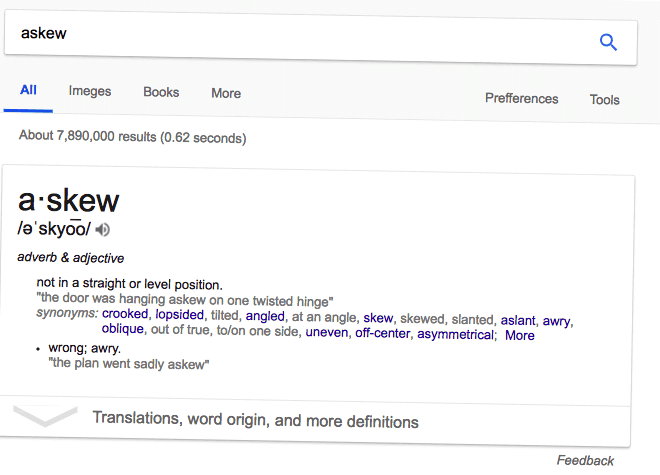
9. Askew

Looking for a definition of the word "askew"? Why tell you, when Google can show you. There's something a little, well, askew about the page below, isn't there?

Google Easter egg of 'askew' results page

Type in "askew" into Google's search bar and you'll get both the word's definition and a literally askew results page to really make sure the meaning sinks in. Who knows how many other visual demonstrations Google produces when expanding your vocabulary ...

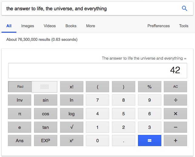
10. The Answer to Life

There are high expectations in this Easter egg, I know. But for fans of Douglas Adams' book, "The Hitchhiker's Guide to the Galaxy," it's worth this long entry into Google's search bar. Type "the answer to life, the universe, and everything," and you'll get the charming and accurate result below:

Google search result for 'the answer to life, the universe, and everything,' referencing The Hitchhiker's Guide to the Galaxy

Followers of Adams' "The Hitchhiker's Guide to the Galaxy" will know "42" as the true meaning of life. For others, it's an inspiration to read this terrific novel -- and do some basic math on Google's native calculator tool (which you can also access by simply typing "calculator").

11. Atari Breakout

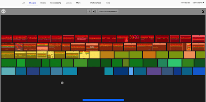
Last, but definitely not least, we have a callback to the classic video game console from the 1970s -- and a favorite mobile game to this day. Type in "atari breakout" into Google Images and get your arrow keys ready. A game of "Breakout" breaks out on your computer screen.

atari-breakout-google-easter-egg

The colored blocks you see above are made up of all the image results for "atari breakout." That means if I play my cards right, the picture above might in fact be part of your next round of this addicting game. When you're done, simply click the "Return to image search" button next to the pause and volume icons.

For the sake of my productivity (and your own), I'll stop there. But that's hardly a comprehensive list of the internet's Easter eggs, and all of them prove how entertaining your users is the key to their loyalty -- no matter what product, solution, or information they're looking for.

There are countless more out there to find, so we'll leave the rest of the hunt up to you. Let the search begin.

New Call-to-action
New Call-to-action


from Marketing https://blog.hubspot.com/marketing/best-internet-easter-eggs-list

Friday, 1 June 2018

4 Things We Want to Know After Reading Mary Meeker's 2018 Internet Trends Report

Each year, marketers, tech writers, and overall online enthusiasts await the release of the 2018 Internet Trends Report: an annual presentation by Kleiner Perkins Caufield & Byers partner Mary Meeker covering the year's most pivotal statistics and trends in the online realm.

The report, while citing key data points -- growth in certain areas of internet use, online shopping trends, and indicators of the future of the workplace -- is exhaustively comprehensive. Meeker leaves no stone unturned, identifying numerous pivotal areas where online user behavior is changing, and where investors, marketers, and others should take note.

The full presentation -- which took place earlier this week at the 2018 annual Code Conference -- can be viewed here.

And even though Meeker's report covers an impressive amount of ground, the information and insights it contains often ends up raising additional questions. If the current is true of X, then what does the future look like for Y?

Here are a few key questions we have about the 2018 Internet Trends Report -- and what the future of tech looks like.

4 Questions We Have About Mary Meeker's 2018 Internet Trends Report

1. The time internet users spend online has increased, but when it comes to the number of new internet users, growth has significantly slowed. Does the future of growth reside in ways for people to connect, rather than getting more people online?

According to Meeker's report, 2017 saw 3.6 internet users globally: a total that amounts to more than half of the world’s population.

"When markets reach [the] mainstream," she writes, "new growth gets harder to find -- evinced by 0% new smartphone unit shipment growth in 2017."

In other words, with the internet becoming more accessible to more people, growth among new users slows. However, among those who are online, the time spent there has increased.

internettrendsreport2018-180530164809(1)-1

Source: Kleiner Perkins Caufield & Byers

“It seems like we’ve reached a point where more internet users would require a greater investment in infrastructure, especially in underserved or underdeveloped regions,” says HubSpot Social Media Editor Henry Franco.

It's what HubSpot Head of SEO Victor Pan says is called the "last mile problem": a term often used when discussing supply chain or transportation to describe the final leg in the process of delivering a good or service to end consumers. That "last mile," as the saying goes, is typically the least efficient step and said by some to be the most expensive part of the delivery process.

It applies to global internet access, Pan simply says, "because getting the internet to the last part of that population is really expensive," largely because of its location in areas that are what he describes as "far and sparse."

Where any product is available in a limited capacity, costs increase. "The remaining areas of the world without internet access are likely less able to afford it," Pan explains. "In that case, you see the overall growth of internet users slowing down."

What we'll end up seeing, Franco predicts, "is a greater investment in more ways to connect existing users, rather than getting new users online."

But even so, focusing innovation on new ways to connect people, rather than getting more of the population connected in the first place, is not without drawbacks, he says. "That could exacerbate skill, knowledge, and privilege gaps that already exist as a result."

2. If the answer to Question 1 is "yes," could this trend be a “golden ticket” for emerging technology like virtual reality, that has struggled to get a strong foothold in consumer and business markets alike? 

"Let's assume the answer is 'yes,'" Pan says. "The golden ticket isn't actually virtual reality ... but rather, a decreased cost for internet access as competition and alternatives increase."

So the future of growth, then, could be less about the new ways the large volume of people who are already online will start to connect (or the emerging technologies that will support them) -- and more about better options for access.

It brings up the question of technology like 5G, which, while considered an emerging technology, is more concerned with better connectivity options than the more niche tools -- see: VR -- that are sometimes "added benefits" of being online.  

At this year's Mobile World Congress, for instance, 5G dominated many of the discussions and presentations, with multiple mobile device manufacturers and wireless providers appearing to battle to be the top provider of this new type of connectivity. The "G" stands for generation, in that this is the fifth generation of this type of connectivity. Currently, 4G powers cellular connectivity like LTE. 

Its goal, fittingly, is to support the rising number of mobile internet users, by providing better speed, handling more data, greater responsiveness, and connectivity to smart devices.

internettrendsreport2018-180530164809(3)

Source: Kleiner Perkins Caufield & Byers

internettrendsreport2018-180530164809(2)

Source: Kleiner Perkins Caufield & Byers

And while developing new technology to improve the experience of a growing mobile-first base is crucial, Pan wonders if even that's moving too far ahead of the "last mile" too quickly.

"Most of the people reading this report, I imagine, are in first world countries and take 4G granted," he says. "Most of the world connects to a 3G connection -- which may lead to poor mobile video streaming experiences, because it's cost-prohibitive. Costs need to come down for user behavior to change."

3. Meeker speaks to the “privacy paradox”: that as innovation becomes a broader channel for growth, it involves a higher degree of personalization that can inevitably require personal user data. Can there be innovation with regulation?

Data privacy has been a widely-discussed and contested topic as of late, ranging from revelations of personal Facebook data misuse by third parties, to the General Data Protection Regulation (GDPR) coming into force last month.

Often, this personal data is used for a purpose that the name suggests: a personalized experience. Facebook, the company's executives have long used as a defense, leverages data and information provided by users to personalize the ads and other content they see in the News Feed, for example.

But as the subject of data privacy becomes more front-and-center, especially amid these current events, many consumers are debating the value of privacy over a personalized experience. Meeker calls this the "privacy paradox."

"Many usability improvements are based on data - collected during the taps/clicks/movements of mobile device users," writes Meeker. "This creates a privacy paradox... Internet Companies continue to make low-priced services better, in part, from user data. Internet Users continue to increase time spent on Internet services based on perceived value. Regulators want to ensure user data is not used ‘improperly.’"

internettrendsreport2018-180530164809(4)

Source: Kleiner Perkins Caufield & Byers

The possibility of regulating personal data (and the Big Tech companies that are so often in possession of it) within the U.S. has also been a frequent topic of discussion this year, regardless of how likely it actually is. Facebook CEO Mark Zuckerberg testified before Congress in two days of hours-long hearings in April, as well as appearing before European Parliament in May. 

But regardless of what these appearances are worth, they do raise the question: Can there be innovation with regulation?

"Meeker's slides tell a compelling story about the lack of general adaptability of U.S. laws towards tech," says Franco. "Our data laws are more than 43 years out of date -- especially as compared to Japan, Korea, and the EU, which have all gotten updates in the last year or so."

internettrendsreport2018-180530164809(5)

Source: Kleiner Perkins Caufield & Byers

Pan, for his part, says that there's a global struggle to find a balance of the two. 

"There two ends of the spectrum," he explains. "One, the government has a hand in all that private data -- like China, or even the U.S. with the PRISM program," the latter being the collection of online communication activity by the National Security Agency, which made headlines when whistleblower Edward Snowden leaked information on the program and had to flee the country.

On the other end of the spectrum, Pan says, there are regions like the European Union, "where data privacy is heavily regulated to protect consumers."

So, is there a balance -- a middle ground along this spectrum -- in the future?

"I think there will be innovation there," says Pan. "I can imagine web hosting companies collect, handle, and keep personally identifiable information secure and data privacy compliant to their respective countries -- for a price."

The idea of "data protection for a price" is not new,  nor is it tremendously popular, according to our research. When we surveyed a panel of 893 consumers -- almost evenly divided among the U.S., UK, and Canada -- to find out how many would pay for an ad-free version of Facebook, 64% said "no."

But knowing how this will impact innovation and the industry at-large, Franco explains, would require a side-by-side comparison of what these varying levels of regulation look like -- especially in the months following GDPR coming into force.

"That would make a really interesting case study," he says, "on the impact on innovation of self-regulation, versus government regulation of tech companies."

4. What, if any, is the psychological impact of the growing amount of time we spend online?

Finally, we revisit the trend of those who are already online spending more time there. According to Meeker's report, the average number of daily hours with digital media (among online adults) increased 4% in 2017.

The debate over disconnecting is also not new. As we spend more time on our devices, there's even a market for getting away from them, with some organizations advertising, essentially, digital detoxes for hire.

This growing amount of time online is particularly true for of time spent on social media, according to the report, with the average global daily minutes spent on such networks increased by 50% between 2012 and 2017 -- for users ranging as young as 16, and as old as 64.

internettrendsreport2018-180530164809(6)

Source: Kleiner Perkins Caufield & Byers

It begs the question: What is the psychological impact of this behavior?

"A lot of teens who come to me for therapy often cite social media as a source of stress," says Laurie Paul, PhD, a psychologist in the Washington, D.C. area. "Many of them talk about inter-personal conflicts with peers that are started or intensified by posts on social media."

This phenomenon, Dr. Paul explains, has real-life consequences. "I’ve had many teens talk to me about experiencing bullying from peers on social media and that this causes a lot of anxiety," she says. "Skipping school, changing friend groups, entire school years ruined -- because of being a target of bullying on social media."

It's not limited to teens, either. When I asked Dr. Paul if she's observed similar effects among adults, the answer was, "Yes."

"I’ve also seen conflicts among young adults that started on social media," she elaborates. "For example, around Father’s Day, I had several clients who were upset, because one of their siblings posted about how wonderful their father was, but in actuality, the father abandoned the family or was abusive."

Again, this online (specifically, social media) behavior had real-life implications. "These posts led to resentment, feeling invalidated, and sparked conflict with the sibling who made the post," Dr. Paul explains. "Sometimes, it sparked broader conflict and taking sides among several members of the family."

So with this concentrated amount of time spent on social media being a fairly recent phenomenon -- with the most explosive growth, it seems, having taken place over a period of only five years -- what are the possible long-term impacts?

"I can only hypothesize. I teach college classes, too, in addition to my clinical practice, and I’ve observed short attention spans," says Dr. Paul. "I wonder if this is related to students spending a lot of time online and being able to rapidly click until they find something interesting."

Until next year's report -- we'll continue to observe the gradual impact of these trends, and how they evolve.

Featured image attribution: By Jasveer10 [CC BY-SA 4.0], from Wikimedia Commons / Cropped from original


from Marketing https://blog.hubspot.com/marketing/mary-meeker-2018-internet-trends-report

Site Search: The Secret to Doubling Your Chances of On-Site Conversion

You’ve spent weeks crafting your website, and it looks great.

At a glance, visitors can see exactly what your company sells, and what you stand for. You have a navigation at the top of the page that brings users to your pricing page, an ‘About Us’ page, and a blog. There are even clear CTAs that encourage visitors to get in touch with your sales team. You feel confident that this website is going to bring in a ton of new leads for your company.

But what happens when someone lands on your site with a very specific question about your product or service?

They click a few links in your navigation, but can’t find an answer. Frustrated, they go back to Google, land on your competitor’s site and find exactly what they are looking for.

That’s a big missed opportunity for your sales team to convert a site visitor into a customer. This visitor had a specific question they were looking to answer when they landed on your site, and the navigation you were previously so confident in didn’t get them an answer quickly enough.

That’s where site search comes in. If Google indexes all the content on the internet and makes it quick and easy to find, site search will do the same for your specific website, making it easy for your visitors to find an exact answer to their question. It tailors their experience on your website in a way that isn’t possible through just your navigation.

Why should you care about site search?

According to WebInc, visitors who use site search are 216% more likely to convert into paying customers than regular visitors. This is because the behavior of someone using site search is largely different from someone just clicking around your navigation.

People using site search have a specific goal in mind. They’ve already gathered all the information they need to make a decision, and they’re simply trying to find a specific product or service on your site.

This is especially true for ecommerce companies. Offering them a simple way to search through your site’s content will go a long way in converting visitors into customers.

Compare this with people who simply click through your navigation. These visitors are simply collecting information, and weighing their options. Maybe they’ll click the link to your blog and peruse a few articles, instead of looking for an exact blog post that answers a specific question.

Search is an integral part of any well-built site, but it has largely flown under the radar for the past couple of years due to Google’s dominance over the space. Google’s own Site Search product made it easy to quickly implement a powerful search engine on your site.

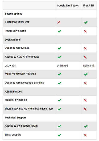
Then in 2017, Google announced that they would be deprecating their Site Search product, and would only offer the free version of the product. Google’s free Site Search offering comes with Google Branding, it takes visitors away from your site, and it's ad-supported -- meaning a competitor’s ad could potentially appear higher than your own organic results. That's obviously not ideal.

Source: Search Engine Land

For businesses looking to scale, Google’s Free CSE simply won’t cut it. A number of enterprise search solutions, such as Swiftype and Algolia seized the moment and are publishing instructions on how to transition from Google Site Search to their solution. Here at HubSpot, we’ve created our own site search solution that will auto-index all of your content as soon as you press publish.

So why has Google deprecating their site search solution created such a frenzy to find a replacement?

Apart from assisting site visitors that are sales-ready, analyzing site search data can go a long way in improving your overall visitor experience, and also help your service, marketing, and web teams better serve your customers.

Ask anyone who has ever worked in customer support, and they’ll tell you that a large portion of their time is spent simply directing people to already documented solutions in a knowledge article or community forum.

This is not only time consuming for your support reps, but its not a great experience for your customers either. According to the Harvard Business Review, 81% of customers try to find a solution themselves before they reach out to a support line. Implementing site search gives your customers the opportunity to solve for themselves.

This will also free up your support team to focus on more mission critical tasks, and can save your service organization a lot of money over time. Companies like Survey Monkey are seeing great results by implementing site search in their help centers. Out of all the people who visit their help center, 96% are able to solve their problem without having to directly contact support.

Your marketing team can gain a lot of insight on your target audience by analyzing exactly what your customers are searching for on your site. Running a search-log analysis not only gives you insight into what your site visitors are trying to find, but it also lets you know how frequently they are searching for something, and what specific language they use to describe the problem they are having, or product or service they’re looking for.

This could inform your marketing team’s decision to release a series of blog posts to address specific questions your visitors have. Maybe you already have that content created, and you simply need to promote it on social, or create an ad campaign to target specific visitors with that content. Search-logs give your marketing team a unique opportunity to tap into the thought process of your site visitors.

Finally, your web team could use search analytics to inform how they structure the site. Letting people search for those niche questions they have is great, but what if they’re commonly searching for your blog, or your pricing page? If these resources used by most site visitors are frequently showing up as searched for terms, you might want to consider featuring them more prominently on your home page or main navigation.

Do you have site search implemented on your site yet? Give it a try and see how quickly adding search to your main navigation can help your sales, service, marketing, and web teams.


from Marketing https://blog.hubspot.com/marketing/site-search

What is Marketing? FAQ

Dictionary.com defines marketing as, “the action or business of promoting and selling products or services, including market research and advertising.”

If you work in a marketing role like I do, it’s probably difficult for you to define marketing even though you see and use it every day -- the term marketing is a bit all-encompassing and variable for a straightforward definition.

This definition feels unhelpful.

The selling part, for instance, overlaps a little too snuggly with a “what is sales” definition, and the word advertising makes me think of Mad Men brainstorming sessions.

But upon digging deeper, I began seeing that actually, marketing does overlap heavily with advertising and sales. Marketing is present in all stages of the business, beginning to end.

At first, I wondered why marketing was a necessary component during product development, or a sales pitch, or retail distribution. But it makes sense when you think about it -- marketers have the firmest finger on the pulse of your consumer persona. They research and analyze your consumers all the time, conducting focus groups, sending out surveys, studying online shopping habits, and asking one underlying question: “Where, when, and how does our consumer want to communicate with our business?”

Marketers are crucial for fine-tuning how a business sells a product to consumers to optimize success.

What’s the Difference Between Advertising and Marketing?

Essentially, if marketing is a wheel, advertising is one spoke of that wheel.

Marketing entails product development, market research, product distribution, sales strategy, public relations, and customer support. Marketing is necessary in all stages of a business’s selling journey.

On the other hand, advertising is just one component of marketing. It’s a paid strategic effort to spread awareness of a product or service, but it’s not the only method used by marketers to sell a product.

The 4 Ps of Marketing

In the 1960’s, E Jerome McCarthy came up with the 4 Ps of marketing: product, price, place, promotion.

Essentially, these 4 Ps explain how marketing interacts with each stage of the business.

Product 

Let’s say you come up with an idea for a product you want your business to sell. What’s next? You probably won’t be successful if you just start selling it.

Instead, you need your marketing team to do market research and answer some critical questions: Who’s your target audience? Is there market fit for this product? What messaging will increase product sales, and on which platforms? How should your product developers modify the product to increase likelihood of success? What do focus groups think of the product, and what questions or hestitations do they have?

Marketers use the answers to these questions to help businesses understand the demand for the product and increase product quality by mentioning concerns stemming from focus group or survey participants.

Price 

Your marketing team will check out competitors’ product prices, or use focus groups and surveys, to estimate how much your ideal customer is willing to pay. Price it too high, and you’ll lose out on a solid customer base. Price it too low, and you might lose more money than you gain. Fortunately, marketers can use industry research and consumer analysis to gauge a good price range.

Place 

It’s critical that your marketing department uses their understanding and analysis of your business’s consumers to offer suggestions for how and where to sell your product. Perhaps they believe an ecommerce site works better than a retail location, or vice versa. Or, maybe they can offer insights into which locations would be most viable to sell your product, either nationally and internationally.

Promotion

This P is likely the one you expected from the get-go: promotion entails any online or print advertisement, event, or discount your marketing team creates to increase awareness and interest in your product, and, ultimately, lead to more sales. During this stage, you’ll likely see methods like public relations campaigns, advertisements, or social media promotions.

Hopefully, our definition and the four Ps help you understand marketing’s purpose and how to define it. Marketing intersects with all areas of a business, so it’s important you understand how to use marketing to increase your business’s efficiency and success.


from Marketing https://blog.hubspot.com/marketing/what-is-marketing

PICA Protocol: A Visualization Prescription for Impactful Data Storytelling - Whiteboard Friday

Posted by Lea-Pica

If you find your presentations are often met with a lukewarm reception, it's a sure sign it's time for you to invest in your data storytelling. By following a few smart rules, a structured approach to data visualization could make all the difference in how stakeholders receive and act upon your insights. In this edition of Whiteboard Friday, we're thrilled to welcome data viz expert Lea Pica to share her strategic methodology for creating highly effective charts.

A Visualization Prescription for Impactful Storytelling

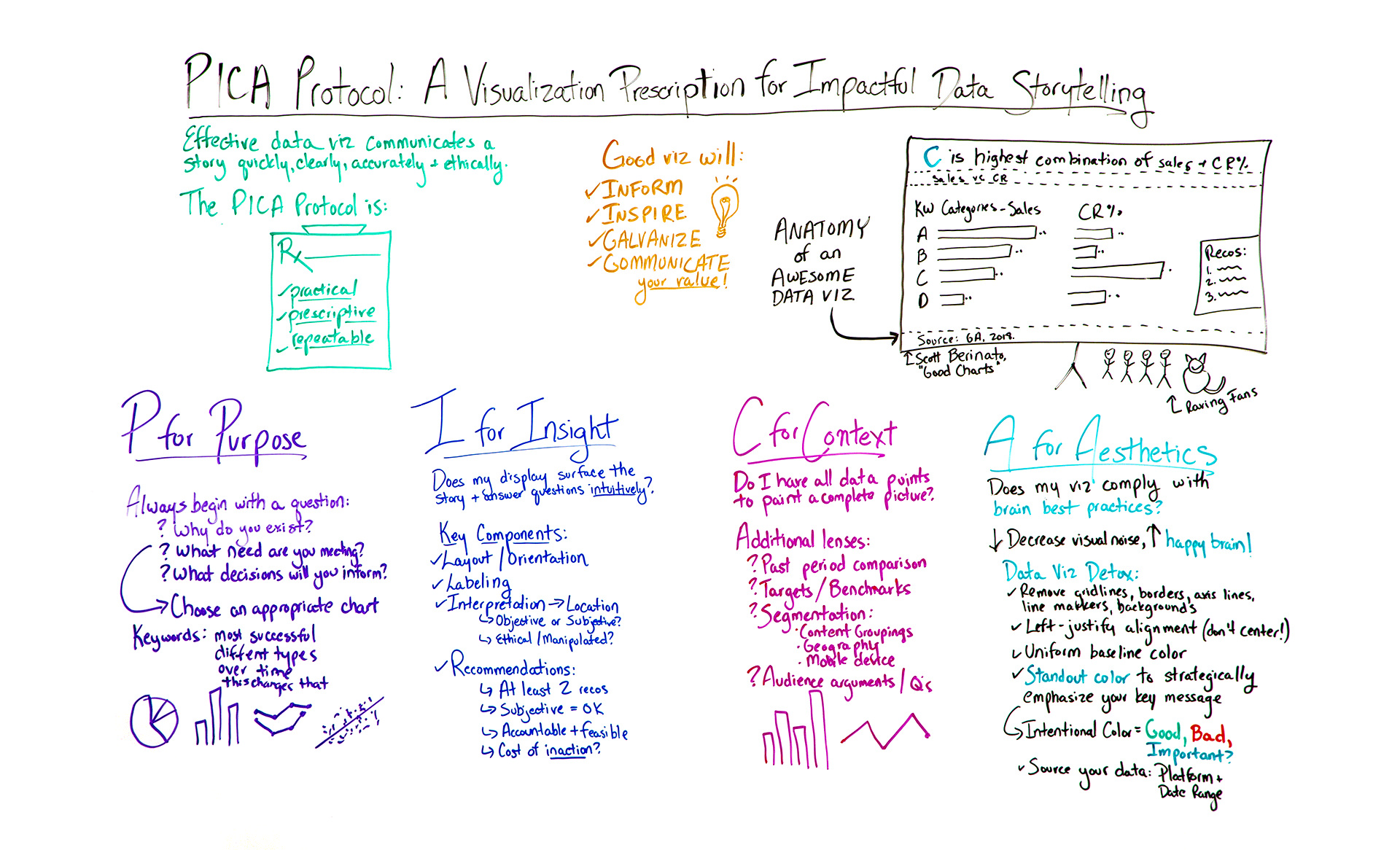
Click on the whiteboard image above to open a high-resolution version in a new tab!

Video Transcription

Hello, Moz fans. Welcome to another edition of Whiteboard Friday. I'm here to talk to you this week about a very hot topic in the digital marketing space. So my name is Lea Pica, and I am a data storytelling trainer, coach, speaker, blogger, and podcaster at LeaPica.com.

I want to tell you a little story. So as 12 years I spent as a digital analyst and SEM, I used to present insights a lot, but nothing ever happened as a result of it. People fell asleep or never responded. No action was being taken. So I decided to figure out what was happening, and I learned all these great tricks for doing it.

What I learned in my journey is that effective data visualization communicates a story quickly, clearly, accurately, and ethically, and it had really four main goals — to inform decisions, to inspire action, to galvanize people, and most importantly to communicate the value of the work that you do.

Now, there are lots of things you can do, but I was struggling to find one specific process that was going to help me get from what I was trying to communicate to getting people to act on it. So I developed my own methodology. It's called the PICA Protocol, and it's a visualization prescription for impactful data storytelling. What I like about this protocol is that it's practical, approachable. It's not complicated. It's prescriptive, and it's repeatable. I believe it's going to get you where you need to go every time.

So let's say one of your managers, clients, stakeholders is asking you for something like, "What are our most successful keyword groups?" Something delightfully vague like that. Now, before you jump into your data visualization platform and start dropping charts like it's hot, I want you to take a step back and start with the first step in the process, which is P for purpose.

P for Purpose

So I found that every great data visualization started with a very focused question or questions.

  • Why do you exist? Get philosophical with it.
  • What need of my audience are you meeting?
  • What decisions are you going to inform?

These questions help you get really focused about what you're going to present and avoid the sort of needle in a haystack approach to seeing what might stick.

So the answers to these questions are going to help you make an important decision, to choose an appropriate chart type for the message that you're trying to convey. Some of the ways you want to do that — I hear you guys are like into keywords a little bit — you want to listen for the keywords of what people are asking you for. So in this case, we have "most successful." Okay, that indicates a comparison. Different types or campaigns or groups, those are categories. So it sounds like what we're going for is a categorical comparison. There are other kinds of keywords you can look for, like changing over time, how this affects that. Answers or opinions. All of those are going to help you determine your most appropriate visual.

Now, in this case, we have a categorical comparison, so I always go back to basics. It's an oldie but goodie, but we're going to do the tried-and-true bar chart. It's universally understood and doesn't have a learning curve. What I would not recommend are pie charts. No, no, no. Unless you only have two segments in your visual and one is unmistakably larger than the other, pie charts are not your best choice for communicating categorical comparison, composition, or ranking.

I for Insight

So we have our choice. We're now going to move on to the next step in the methodology, which is I for insight. So an insight is something that gives a person a capacity to understand something quickly, accurately, and intuitively. Think of those criteria.

So here, does my display surface the story and answer these questions intuitively? That's our criteria. The components of that are:

  • Layout and orientation. So how is the chart configured? Very often we'll use vertical bar charts for categorical comparison, but that will end up having diagonal labels if they're really long, and unless your audience walks around like this all the time, it's going to be confusing because that would be weird. So you want to make sure it's oriented well.
  • Labeling. In the case of bars, I always prefer to label each bar directly rather than relying on just an axis, because then their eyes aren't jumping from bar to axis to bar to axis and they're paying more attention to you. That's also for line charts. Very often I'll label a line with a maximum, a minimum, and maybe the most important data point.
  • Interpretation of the data and where we're placing it, the location.
    • So our interpretation, is it objective or is it subjective? So subjective words are like better or worse or stupid or awesome. Those are opinions. But objective words are higher, lower, most efficient, least efficient. So you really want your observations to be objective.
    • Have you presented it ethically? Or have you manipulated the view in a way that isn't telling a really ethical picture, like adjusting a bar axis above zero, which is a no-no? But you can do that with a line graph in certain cases. So look for those nuances. You want to basically ask yourself, "Would I be able to uphold this visual in a court of law or sleep at night?"
    • Location of that insight. So very often we'll put our insights, our interpretation down here or in really tiny letters up here. Then up here we'll put big letters saying this is sales, my keyword category. No. What we want to do is we want to put our interpretation up here. This top area is the most important real estate on your visual. That's where their eyes are going to look first. So think of this like a BuzzFeed headline for your visual. What do you want them to take away? You can always put what the chart is here in a little subtitle.
  • Make recommendations. Because that's what a really powerful visual is going to do.
    • I always suggest having two recommendations at least, because this way you're empowering your audience with a choice. This way you can actually be subjective. That is okay in this case, because that's your unique subject matter expertise.
    • Are your recommendations accountable to specific people? Are they feasible?
    • What's the cost of not acting on your recommendations? Put some urgency behind it. So I like to put my recommendations in a little box or callout on the side here so it's really clear after I've presented my facts.

C for Context

The next step in the methodology is C for context. What this is saying is, "Do I have all the data points I need to paint a complete picture, or is there more to this story?" So some additional lenses you might find useful are past period comparison, targets or benchmarks are useful, segmentation, things like geography, mobile device. Or what are the typical questions or arguments that your audience has when you present data? They can be super value contextual points.

In this case, I might decide that while they care about the number of sales, because that's most successful to them, I care about the keywords "conversion rates." So I'm going to add a second bar chart here like this, and I'm going to see there's a different story that's popping out here now.

Now, this is where your data storytelling really comes into play. This particular strategy is called a table lens or a side-by-side bar chart. It's what I recommend if you want to combine two categorical metrics together.

A for Aesthetics

Now, the last step in the methodology is A for aesthetics. Aesthetics are how things look. So it's not about making it look pretty. No, it's asking, "Does my viz comply with brain best practices of how we absorb information?"

1. Decrease visual noise

So the first step in doing that is we want to decrease visual noise, because that creates a lot of tension. So decreasing noise will increase the chance of a happy brain.

Now, I'm a crunchy granola hippie, so I love to detox every day. I've developed a data visualization detox that entails removing things like grid lines, borders, axis lines, line markers, and backgrounds. Get all of that junk out of there, really clean up. You can align everything to the left to make sure that the brain is following things properly down. Don't center everything.

2. Use uniform colors (plus one standout color for emphasis)

Now, you'll notice that most of my bars here have a uniform color — simple black. I like to color everything one color, because then I'll use a separate, standout color, like this blue, to strategically emphasize my key message. You might notice that I did that throughout this step for the words that I want you to pick out. That's why I colored these particular bars, because this feels like the story to me, because that is the storytelling part of this message.

Notice that I also colored the category in my observation to create a connective tissue between these two items. So using color intentionally means things like using green for good and red for bad, not arbitrarily, and then maybe blue for what's important.

3. Source your data

Then finally, you always want to source your data. That increases the trust. So you want to put your platform and your date range. Really simple.

So this is the anatomy of an awesome data viz. I've adapted it from a great book called "Good Charts" by my friend, Scott Berinato. What I have found that by using this protocol, you're going to end up with these wonderful, raving fans who are going to love your work and understand your value. I included a little kitty fan because I can. It's my Whiteboard Friday.

So that is the protocol. I actually have included a free gift for you today. If you click the link at the end of this post, you'll be able to sign up for a Chart Detox Checklist, a full printable PICA Protocol prescription and a Chart Choosing Guide.

Get the PICA Protocol prescription

I would actually love to hear from you. What are the kinds of struggles that you have in presenting your insights to stakeholders, where you just feel like they're not getting the value of what you're doing? I'd love to hear any questions you have about the methodology as well.

So thank you for watching this edition of Whiteboard Friday. I hope you enjoyed it. We'll see you next week, and please remember to viz responsibly, my friends. Namaste.

Video transcription by Speechpad.com


Sign up for The Moz Top 10, a semimonthly mailer updating you on the top ten hottest pieces of SEO news, tips, and rad links uncovered by the Moz team. Think of it as your exclusive digest of stuff you don't have time to hunt down but want to read!


from The Moz Blog http://tracking.feedpress.it/link/9375/9327026